Branding Systems
Below are three branding systems I’ve created for two architecture firms, and a psychoanalyst.
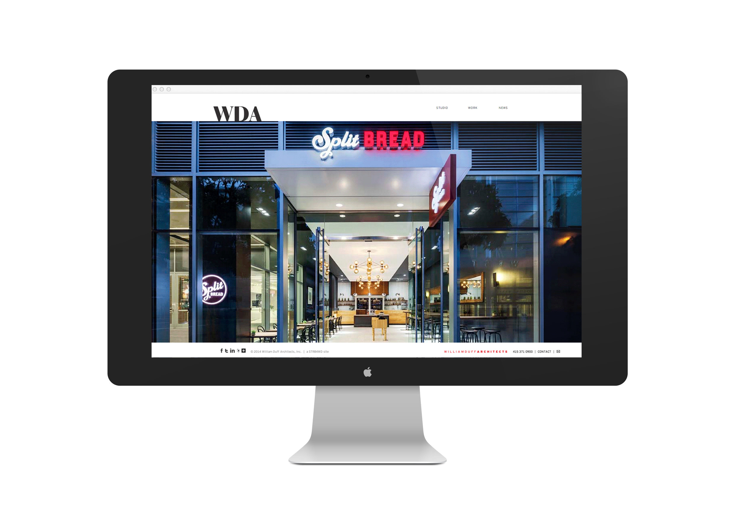
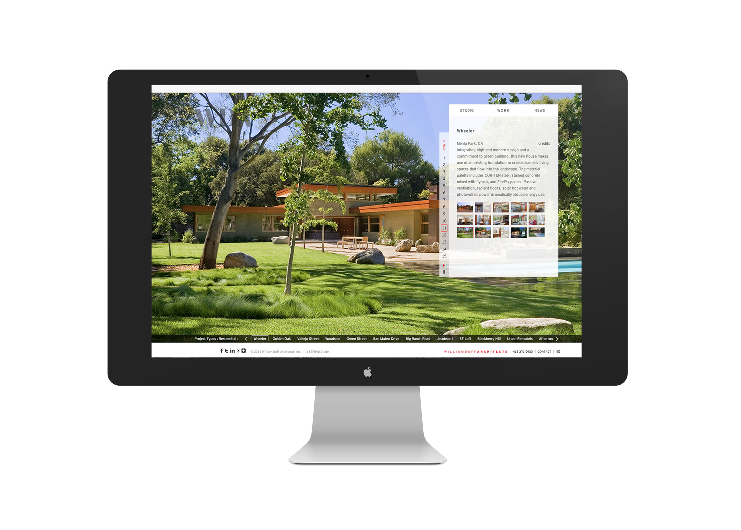
WDA
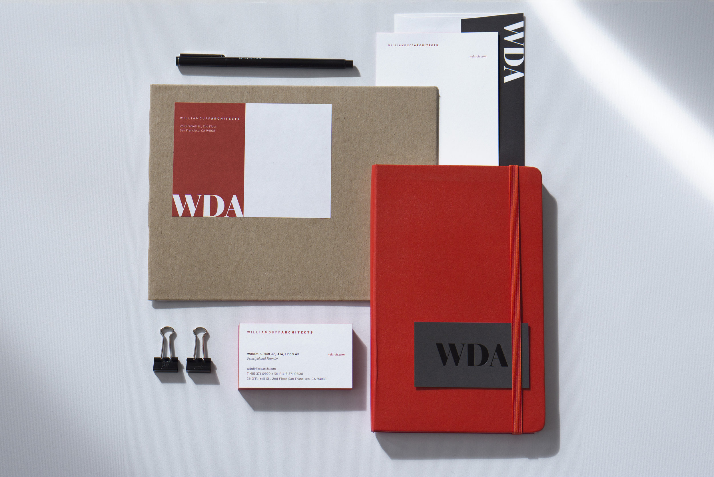
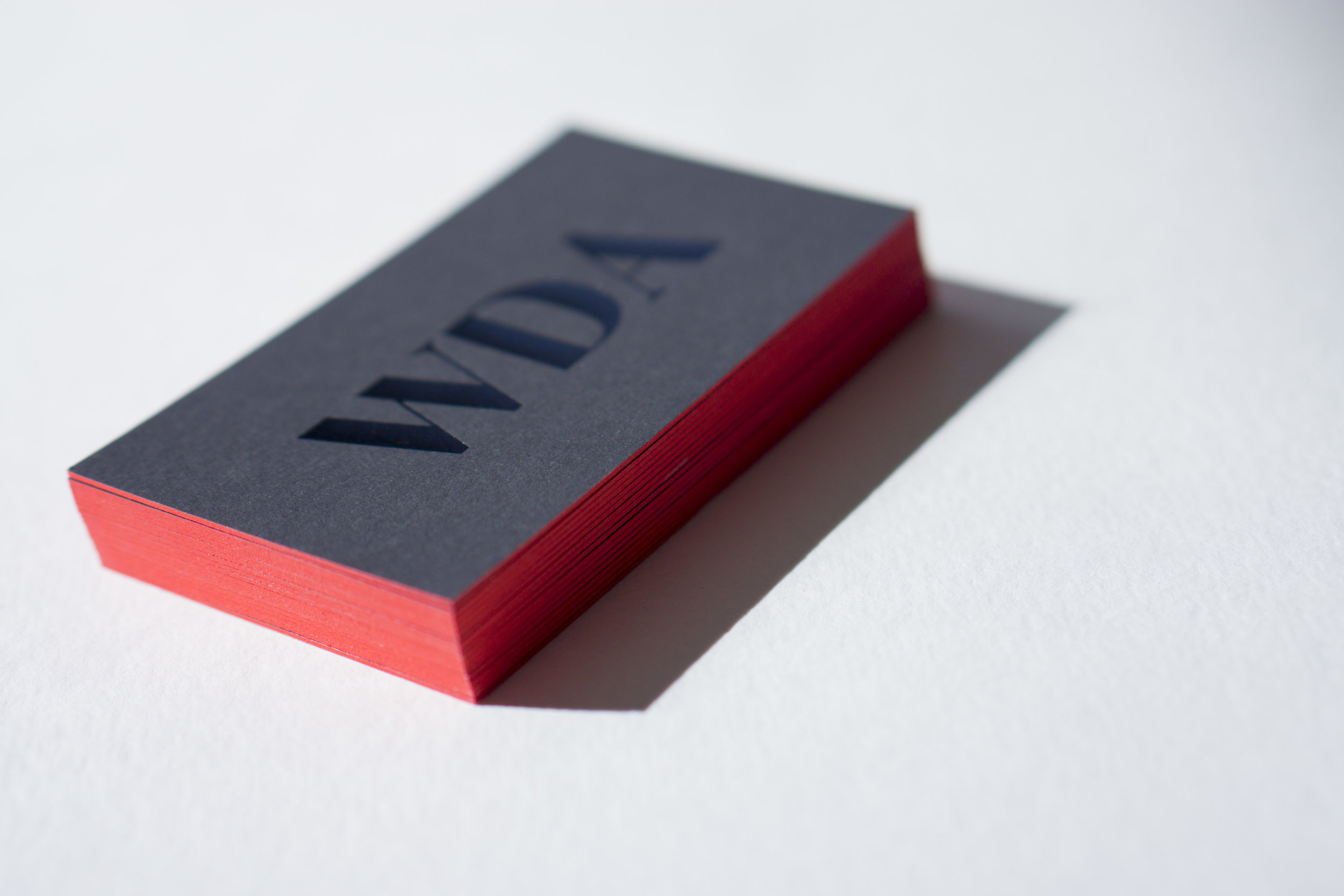
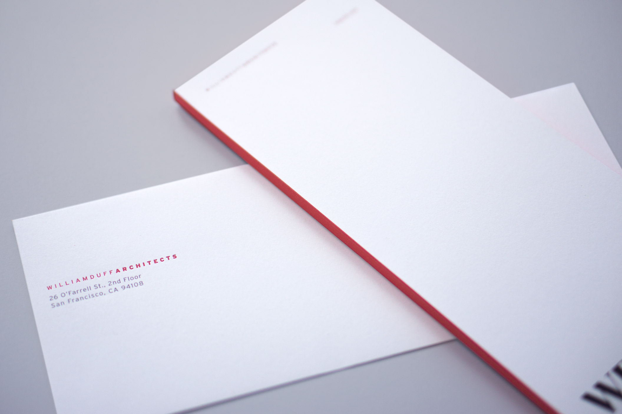
Architecture is design in three dimensions. So designing for an architect has to be smart, structural, and detail-oriented. William Duff Architects wanted a visual identity that reflected their academic roots, modernity, and commitment to green building.
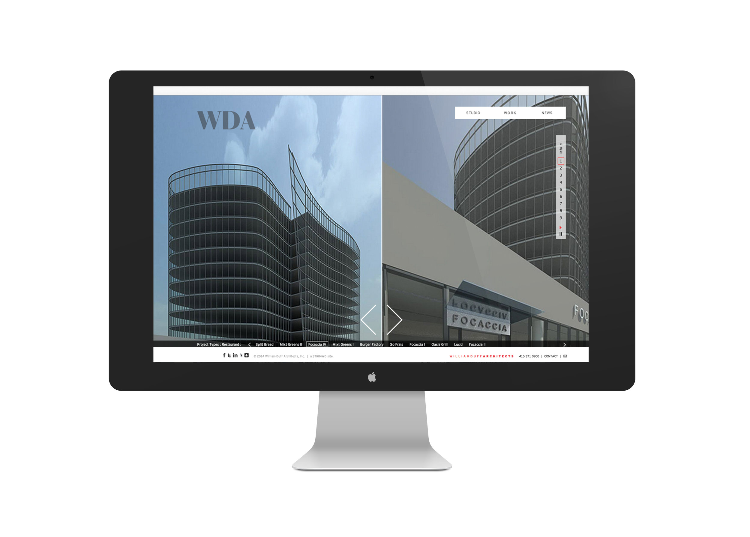
Working with Straightforward Creative, I developed a new logo and wordmark that captured the essence of the firm: expansive, tactile, with a personal approach. These elements could be used together and separately, creating a cohesive system that works across both print and digital, including responsive design elements that allow for dynamic content on smartphones and tablets.
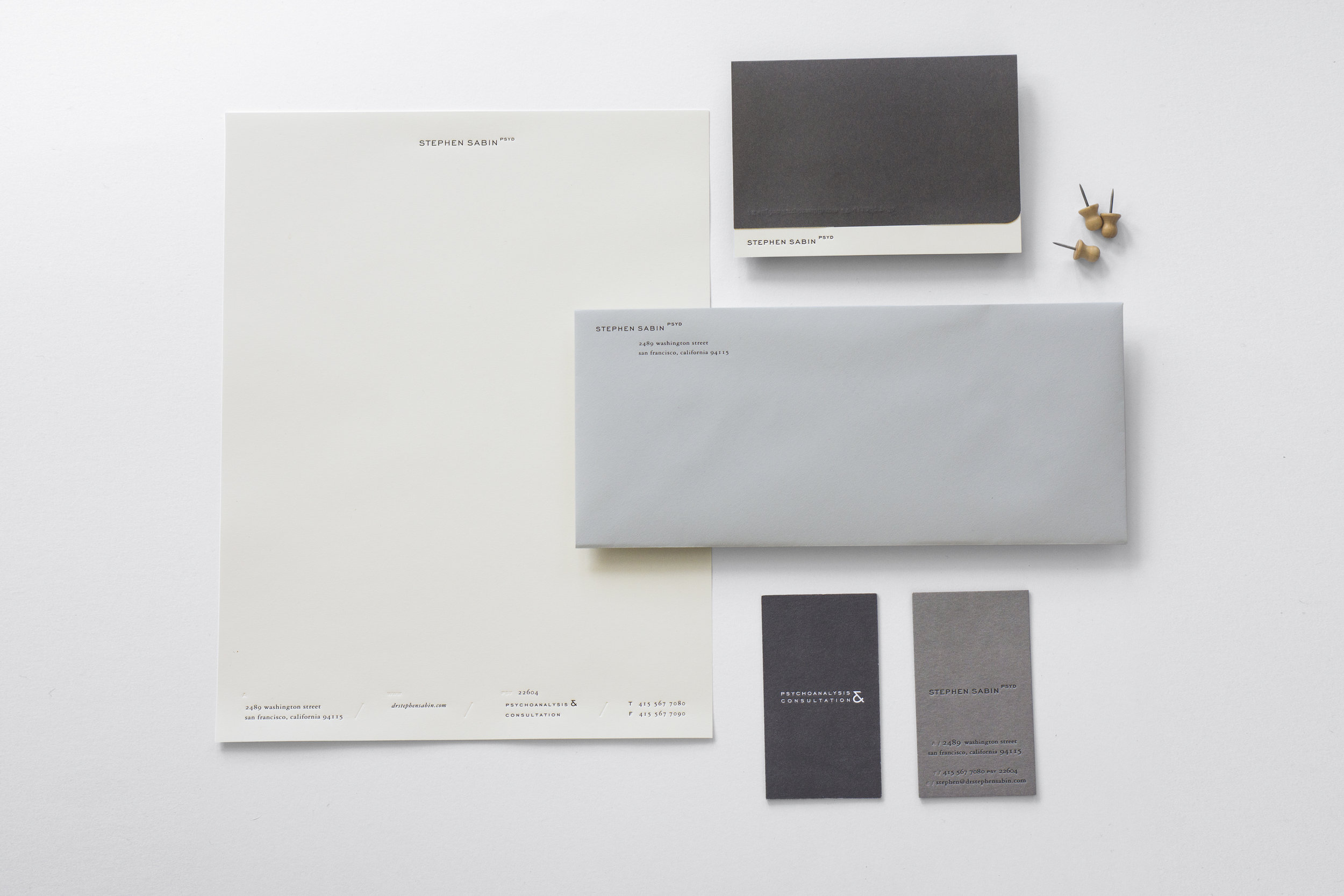
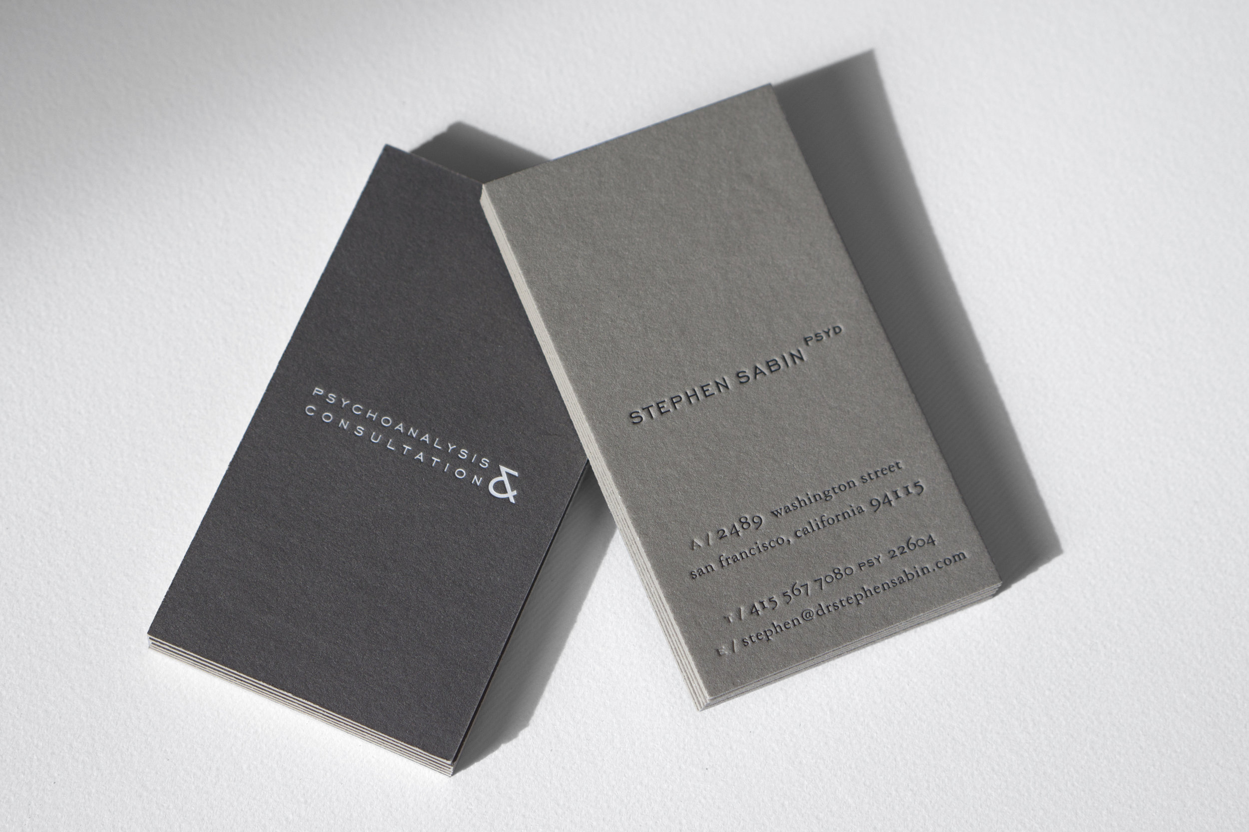
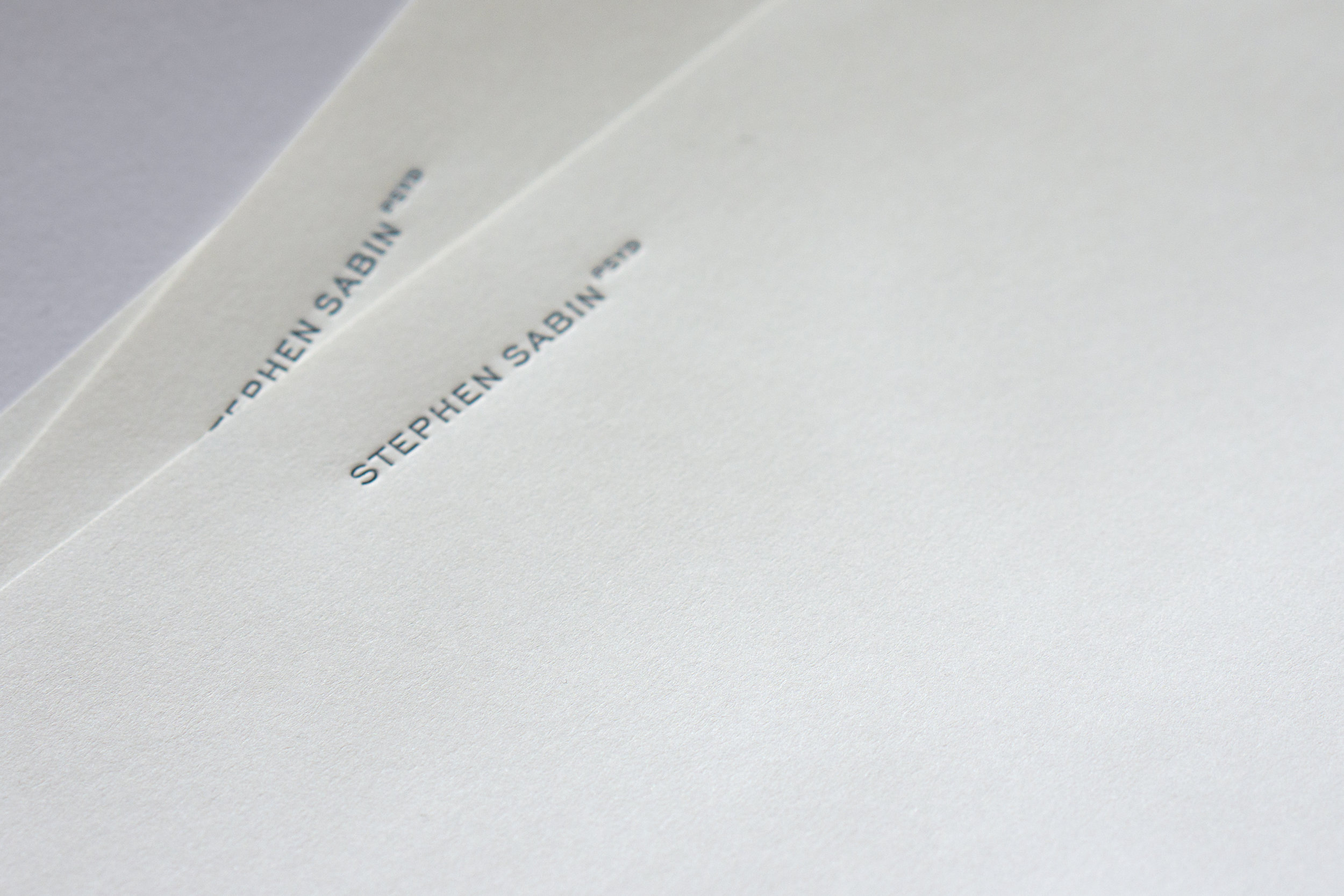
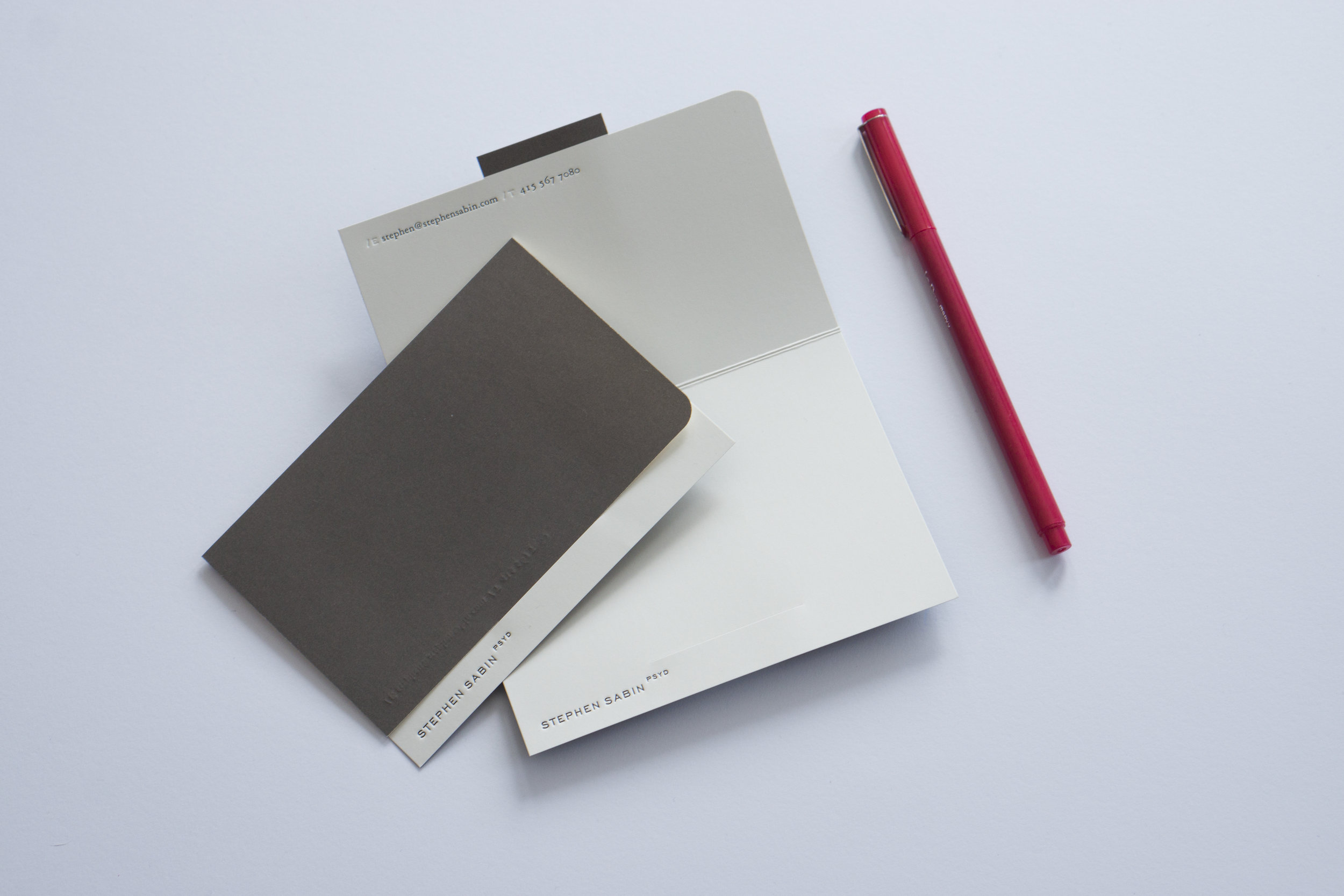
Sabin
San Francisco-based therapist and psychoanalyst, Dr. Stephen Sabin, wanted a business system that reflected both his practice and himself. To articulate the steady and solid essence of his work, I used neutral shades of grey and creams combined with rich paper textures and letterpress type.
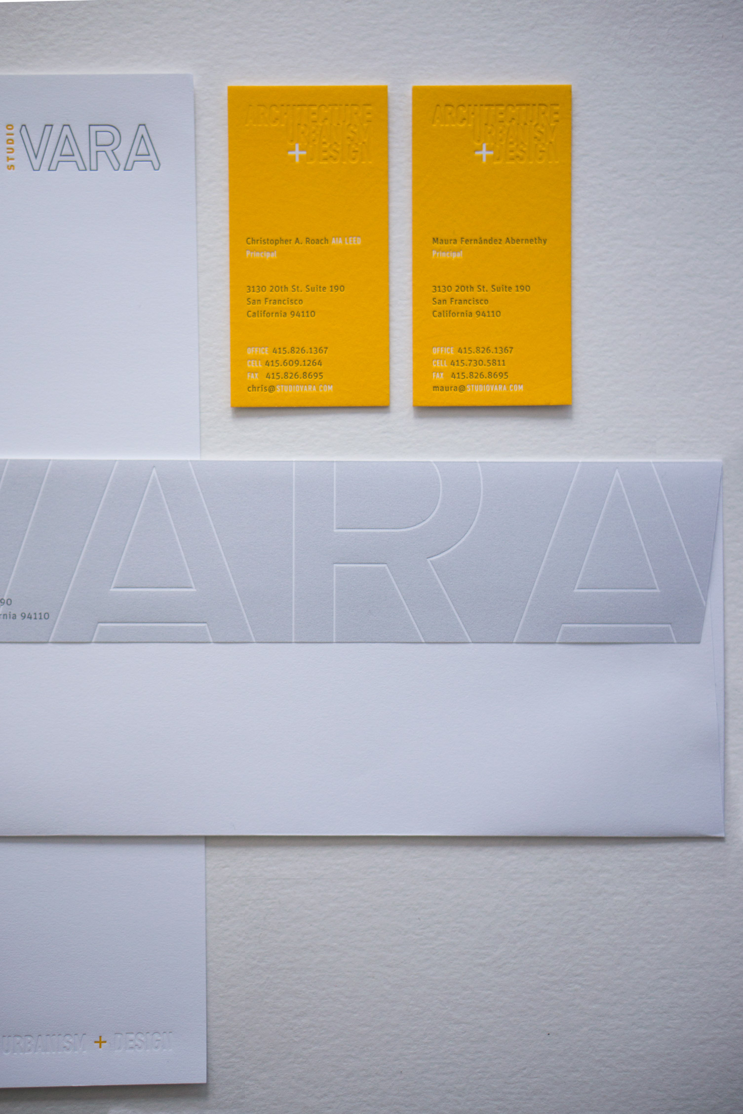
Studio VARA
Vara—in Spain, Portugal, and Latin America—is a unit of measure equal to 33 inches. This seemingly foreign measurement was ingrained in the streets of San Francisco in the early 1900s when each city block was designed to measure exactly 100 x 150 vara. True story.
As the namesake of the company, the vara became the guiding principle for the business identity, accentuating Studio VARA’s specialty in urban design and development. A grid of San Francisco neighborhoods was blind stamped on the back of each business card. And employees were given a collection of different streets for their cards.

